Art Bash

Year
2026
Role
Concept, Pitch, Branding, Design System, Motion
Studio
Certo Creative
Client
Art Gallery of Ontario
AGO Art Bash is the Art Gallery of Ontario’s (AGO) annual fundraising gala that supports the museum’s collections, exhibitions, and programs. Each year, the event brings together hundreds of guests for an evening of contemporary art installations, live music, fashion, food, and drinks. Art Bash 2026 was inspired by classic rock and the AGO’s exhibition featuring Canadian musician Melissa Auf der Maur’s 1990s rock-band tour photography.

At Certo Creative, we were tasked with developing a visual identity that captured the grungy, kinetic, and authentic spirit of rock and roll. The identity needed to work across a range of applications, from the AGO’s website and social media to physical print materials, while generating enough energy to attract guests to the event. The identity was developed over the six months leading up to the gala, which ultimately brought together 1,000 AGO supporters and raised a record-setting $1.6 million CAD for the museum.
Concept
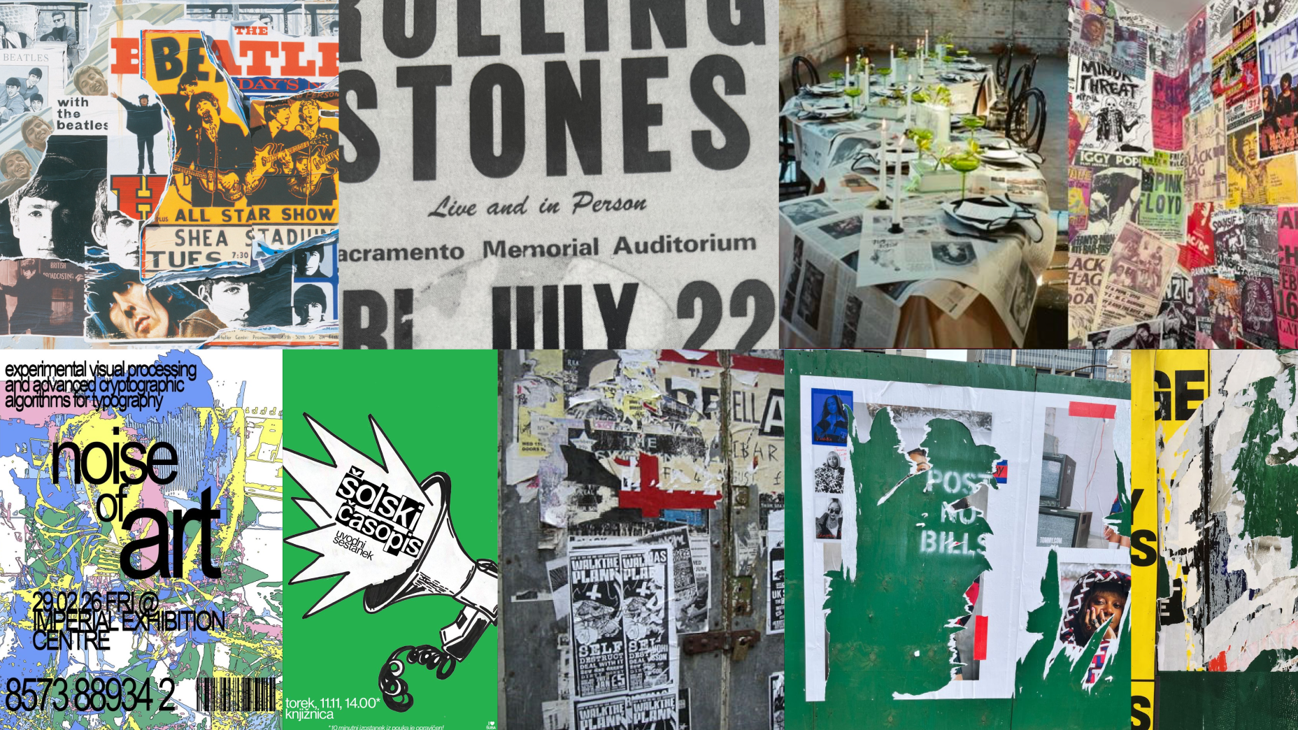
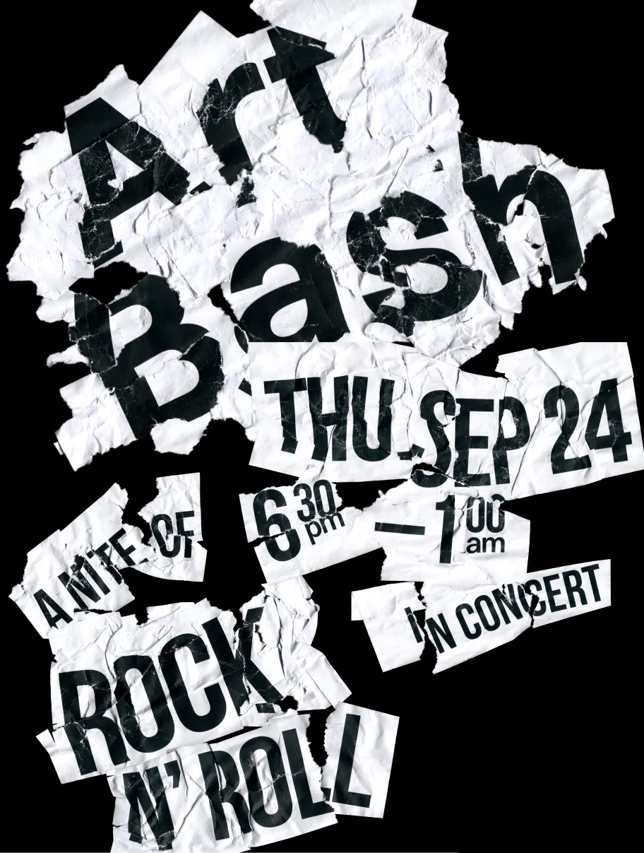
My initial concept was inspired by flyposting—the pasted, torn, and distressed layers of posters found on city streets and outside music venues. I was drawn to the visual noise created by overlapping rips, crinkles, and paper fragments, which felt like a natural expression of grunge and rock.

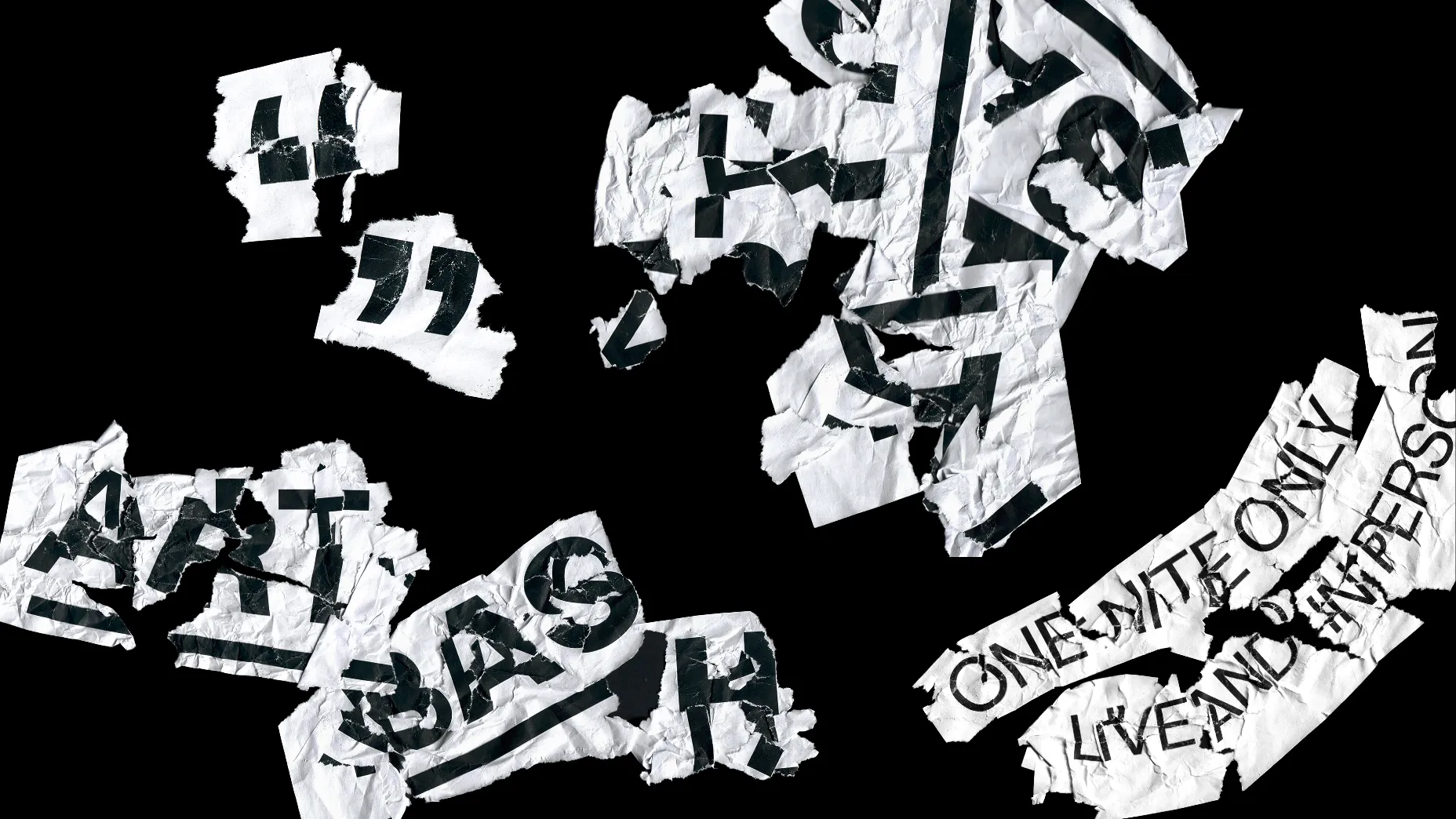
Drawing from vintage rock and roll graphic design, bold sans-serif typography was used to cut through visual distress and communicate event details in concert language such as “one nite only.” I printed typographic compositions on letter-size paper before experimenting with water, glue, ripping, plastering, layering, and reassembling the sheets. The goal was to find a balance between physical distortion and legibility, while exploring different ways to manipulate individual letterforms.

Once dried, the typography was scanned and brought back into the digital environment, creating a tactile, photographic quality while retaining control over the final compositions.
Development
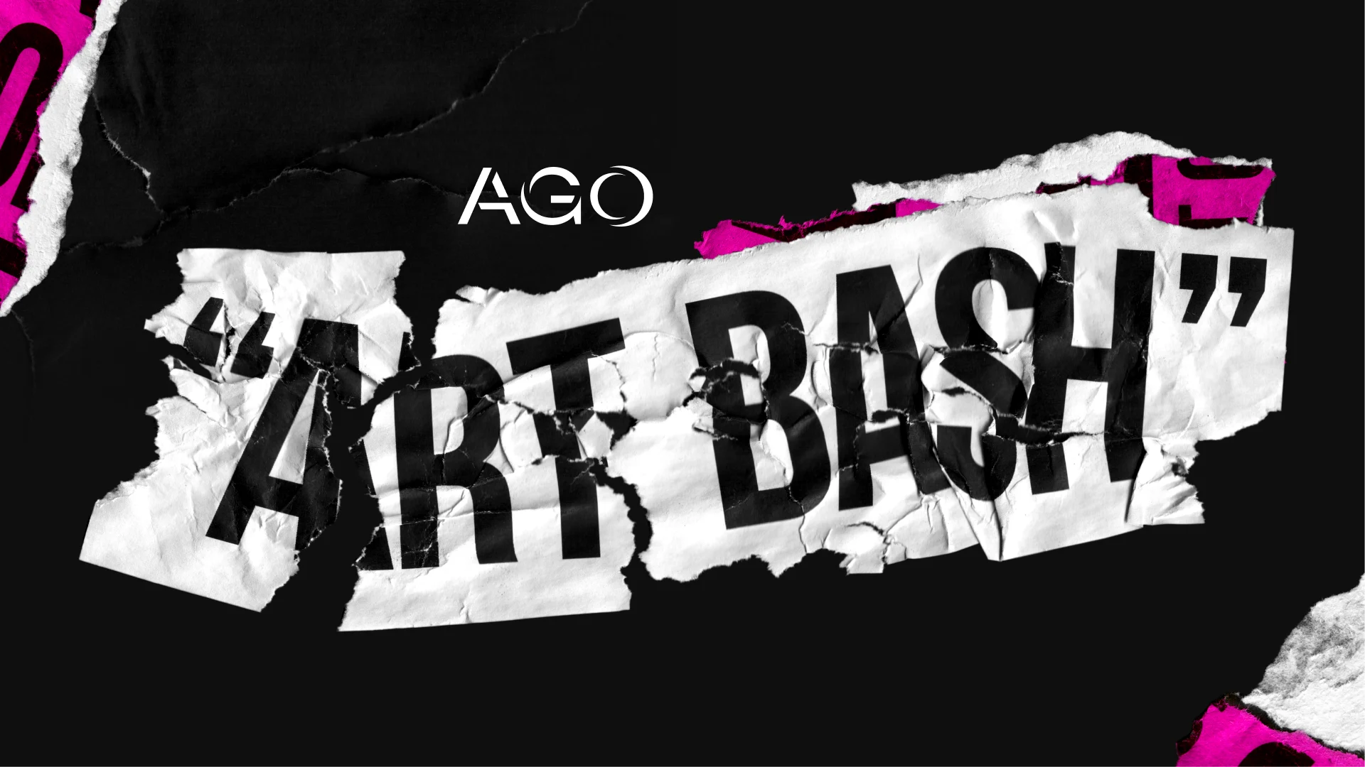
During the concept development phase, I also experimented with printing directly onto coloured craft paper. This referenced the inexpensive, textured stocks historically used to promote underground concerts while introducing colour into an otherwise stark black-and-white system. Combining the ripped craft paper with distressed typography created an additional layer of texture that could flex around event copy across applications such as webpages, menus, and signage.
Final Identity
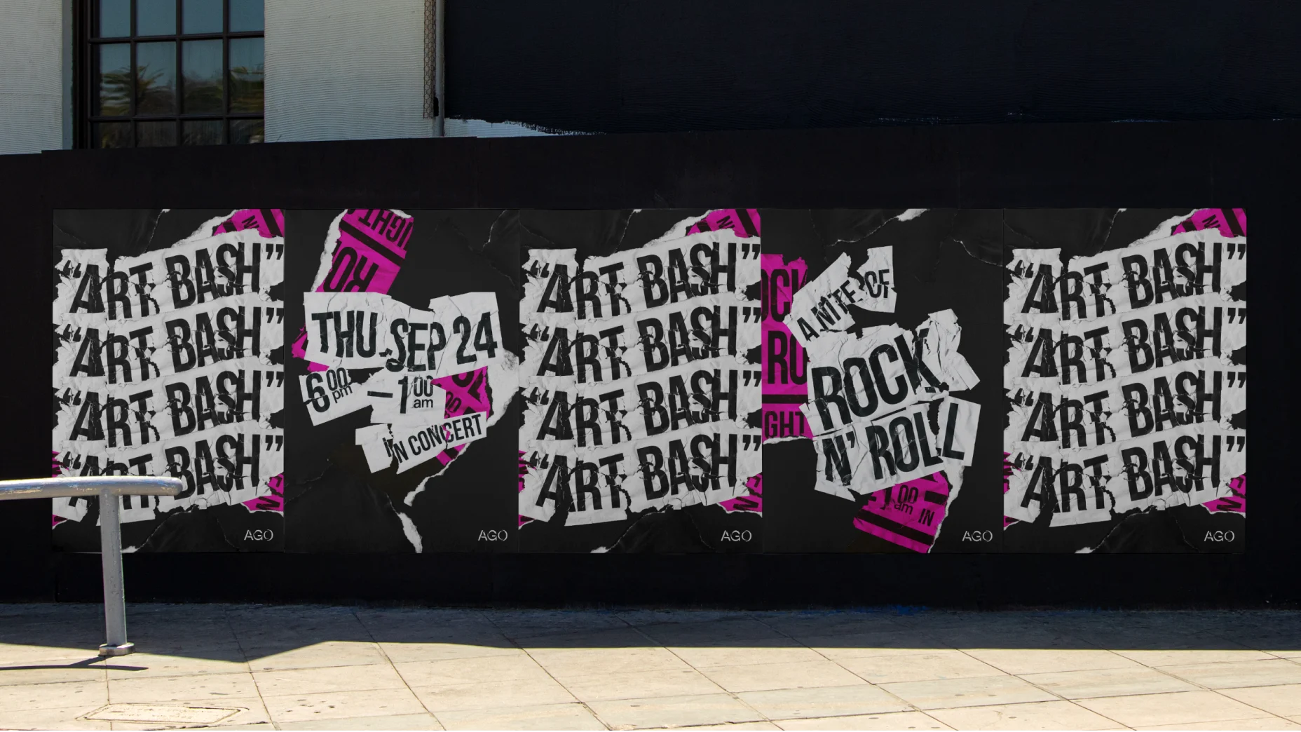
Through collaboration with the AGO, the paper elements evolved into an electric pink, giving the identity a more irreverent, punk-inspired character. Once finalized, the system was extended across digital and physical applications, including web banners, social media, blog graphics, posters, menus, and signage.

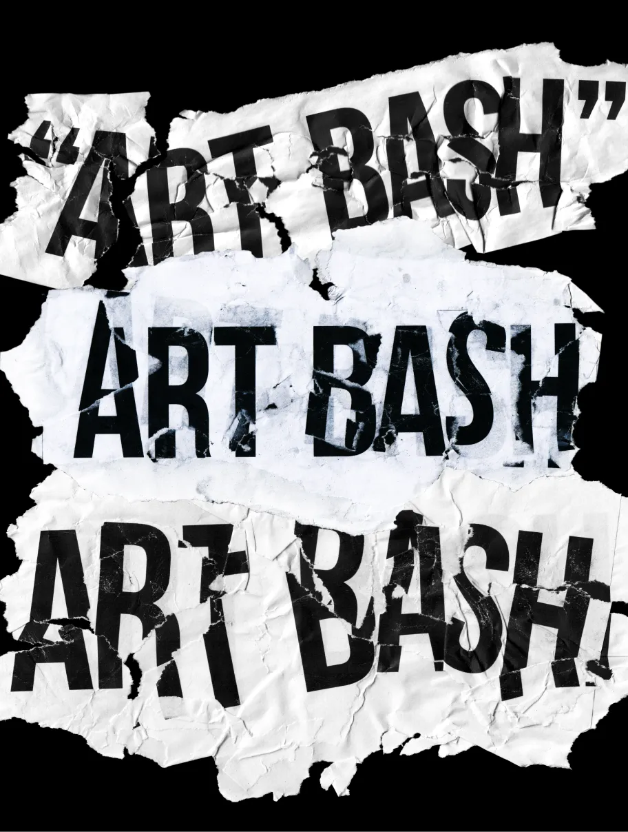
Repetition became a key compositional device, drawing from the appearance of walls covered in layers of flyposted posters. This approach translated particularly well to motion, allowing individual elements to build into dense, energetic compositions. Supporting copy was set in Switzer to provide a cleaner counterpoint to the distressed display typography. Small typographic irregularities—including intentionally varied tracking and slightly rotated paragraphs—introduced a typewriter-like sense of imperfection while maintaining readability.

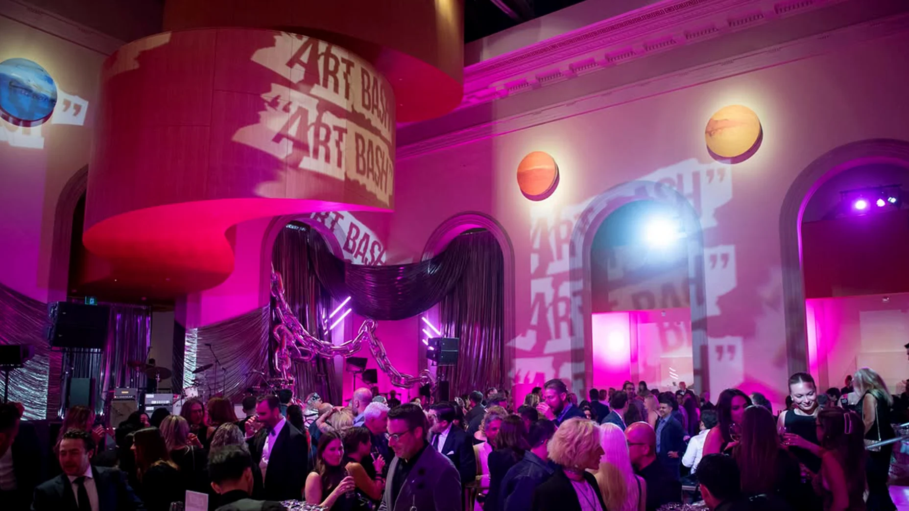
The final identity extended beyond promotional materials and into the event itself, appearing as projected graphics throughout Walker Court as well as in directional signage and printed materials throughout the gallery.